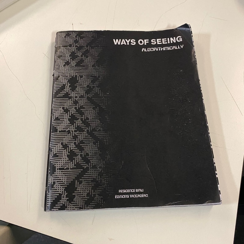
What is montage theory?
Montage theory is a film making technique invented in Russia, in the 1920s, by Sergei Eisenstein. It is when two frames are paired to create a certain emotion, that can only be achieved with the two images together. Although this technique was created for film making, it was later brought to photography, due to its creative nature. In the 1970s, half frame cameras were developed, allowing a roll of film to be used to capture twice as many photographs, saving lots of money, by having to buy half as many rolls of film. Whilst this was mainly used to save money for people who simply used cameras to document their holidays, etc, it is also used by professional photographers to create unique images, that may contrast each other, complement each other or relate to each other in a hidden way, which may only be known by the photographer. Due to two frame cameras being intended for the masses and ordinary people who are looking for a budget option, two frame cameras are not very high quality. Splitting a single 35mm frame In two also makes the quality worse, whilst this is not professional, the images taken by these cameras can be very persuading as documentary photography, due to amateur images being perceived are more trustworthy as documentation than professional images, therefore it may be a good option for documentary photographers who want their images to be trusted sources. As well as this, is also makes them convenient as film has to be changed two times less than usual, being very useful where changing film may be challenging, such as a concert, war zone, protest, busy social gathering. The following artists are examples of people who use two frame cameras in a professional way.
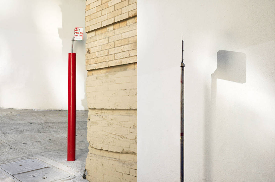
John Maclean
John Maclean takes two frame photographs, matching the colours in the two frames to make the two images look coherent. Some of the two frames of John Macleans images are the same scene or object from a different angle. I believe that John Macleans work is thought provoking, as it forces you to look at a single scene or object for longer, as it may be the subject for both images, from different angles, forcing the reader to wonder what its may be and where it could be.
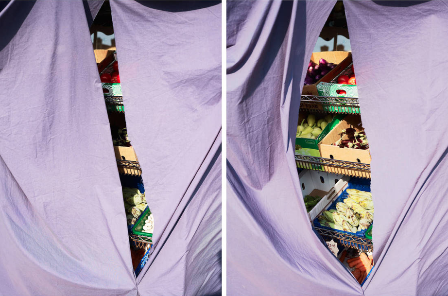
Osma Harvilahti
Osma Harvilahti's images are very contrasting, and unlike John Maclean, the subject is not repeated in these images. Instead, colours and ideas are repeated in these diptychs, suck as the idea of motion in the second day-tic and the colour purple In the first. This makes the viewer wonder why this is being repeated and emphasised.
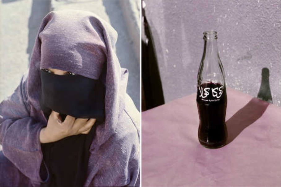
Mike Terry
Mike Terry, unlike the previous two artists, seems to pair the diptychs without knowing what they might be. This make the diptychs completely random. This seems to leave the images without a hidden meaning, however, Mike Terry's emotions can possibly b reflected in these photographs. The exposure of the image, and the saturation could all reveal something unique about his mood when photographing the subject.
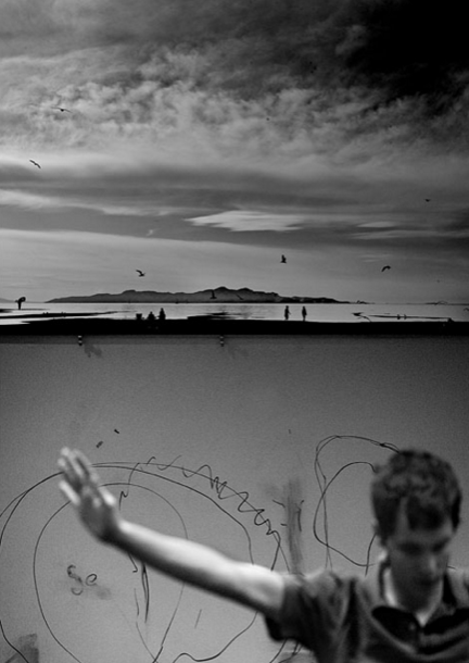
Attempting diptychs
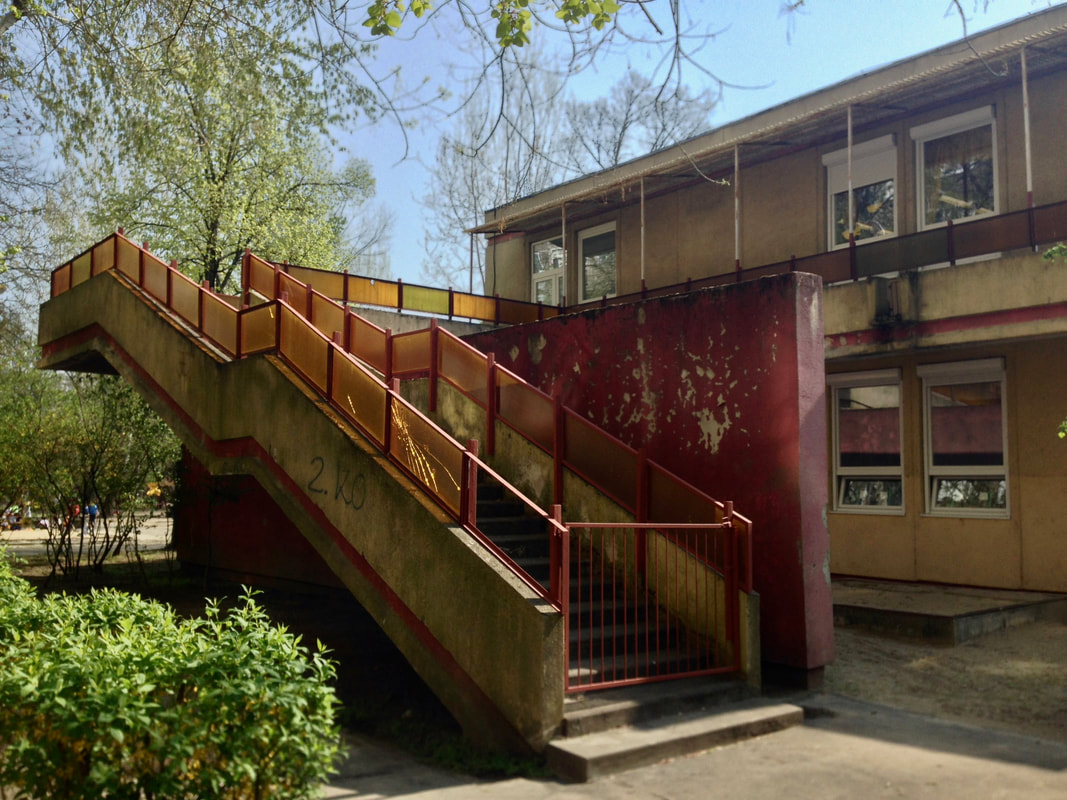
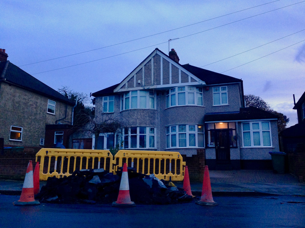
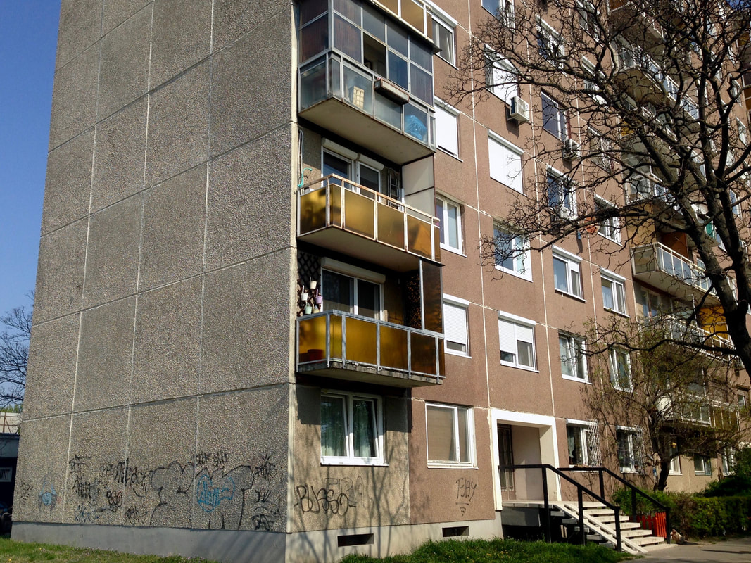
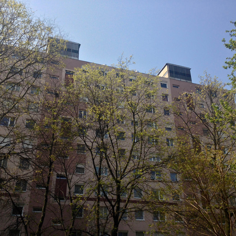
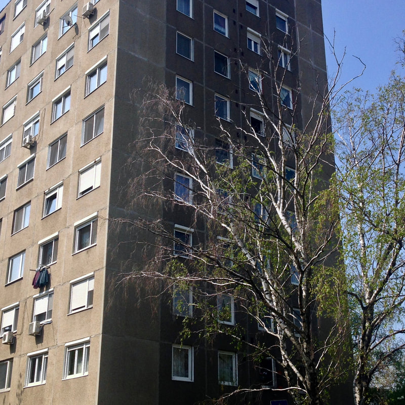
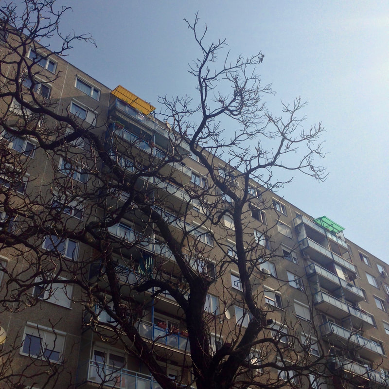
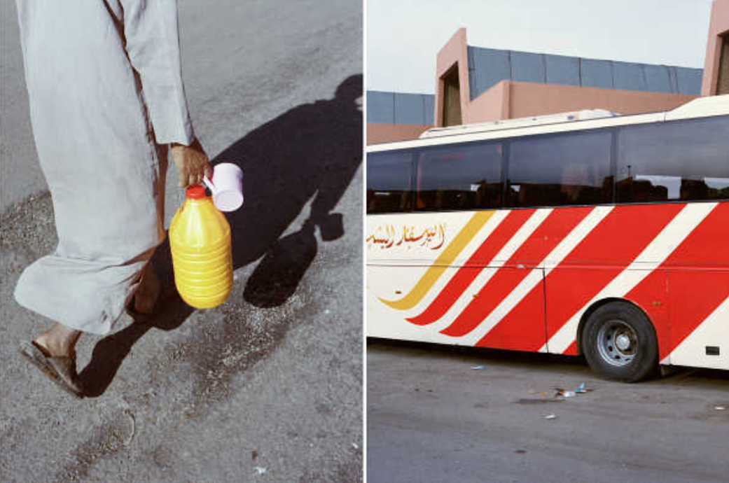
All of the images taken in this series of diptychs were shot on a phone camera. The first image in the series is an older images taken in the 15th district of Budapest in the summer of 2019, in the Újpalota housing estate, built in the 1960s. The second image in the diptych series is an image taken in a London suburb, located in Eltham, near my house. These series of diptychs contrast each other as one was taken in a government housing estate, whereas the other houses are in a suburb, showing two different types of lifestyles. The time that the photographs were taken also contrast, as one was taken during the summer, and the other at the beginning of winter. The photographs in the series were not carefully selected to to side by side, but instead, a random image taken in Budapest
History of the photobook
British Algae by Anna Atkins
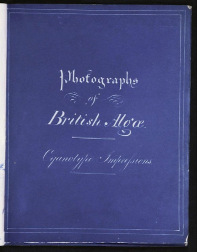
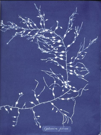
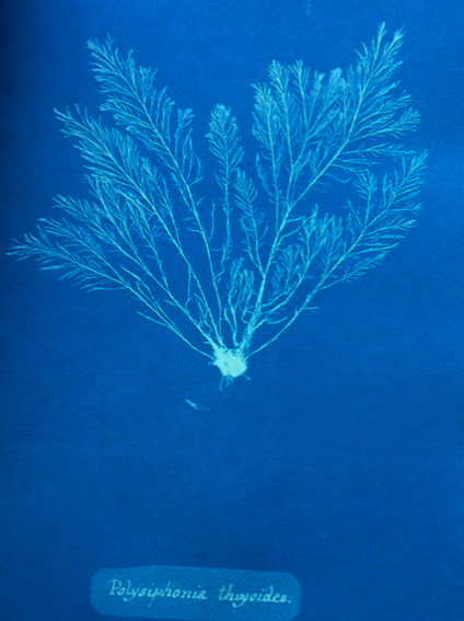
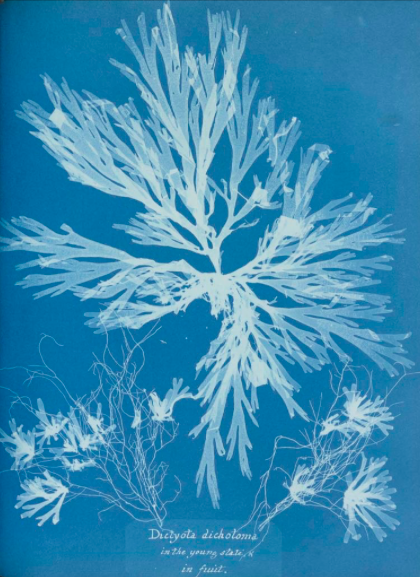
Anna Atkins was born in Tunbridge in 1799. Unlike most women at the time, she received lots of scientific education. After she married in 1825, she pursued her interests in botany, collecting large numbers of dried plants. This led her to become a member of the royal botanical society in 1839. She was taught by William Henry Fox Talbot about some of his photographic inventions. She was close to her father John George Children, and implemented his invention of the cyanotype, invented by one of her inspirations, Sir John Herschel. She is often regarded as the first female photographer, although this is debated. In 1843, she published these herself in a 3 book series, making them in very limited numbers. It is estimates that only 17 copies were made by her, gibing them only to close friends and donated one to the royal library. She may have chosen to use cyanotypes as it proves to be a very accurate method of showing the exact dimensions of the plants, more than a drawing, which was the most popular method of picturing plants in botanical books. It is also significant that she chose to make this project into a photography book, in limited numbers. Whilst this was unheard of before she published the book, it is more accurate than painting or drawing the pants. For this, she would have had to hire a botanical artist, and most likely would have taken much longer that the cyanotypes did. She could also do this process by herself without help. It was likely the best decision to make these prints into a photography book as it was easy to distribute, and was more convenient to hand out than many large prints to be frames and put on the wall. This also allowed more prints to fit into a more compact area than if it was not in a book.
The Pencil of Nature by William Henry Fox Talbot
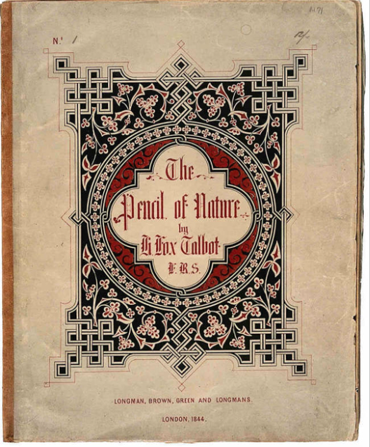
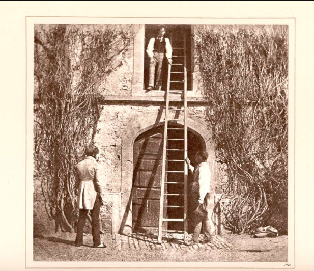
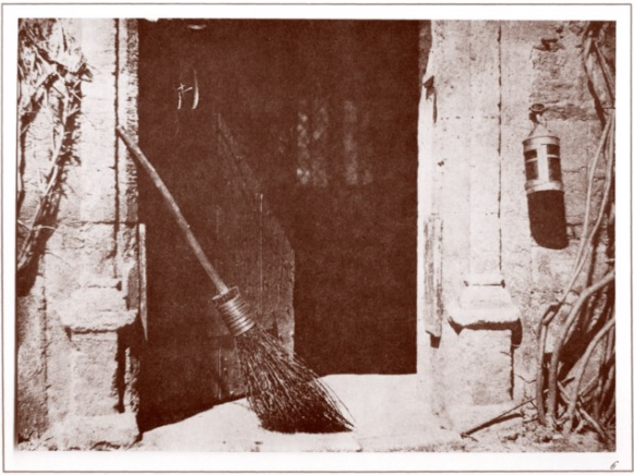
William Henry Fox Talbot was born in 1800 in Dorset. Due to him being a scientist, he looked for new ways of accurately reproducing object that may be important to science. He is the inventor of the calotype and salted paper. The calotype was the alternative to the French process of Daguerreotype, which was very popular after its invention, however, the calotype is the process which provides a negative images which can then be made positive, which is similar to modern photographic film which is still used today. This calotype process was used to make his book called The Pencil of Nature, which included 24 calotype photographs, and is regarded as the first commercially published photography book. Due to it only including 24 photographs, it was much easier to print more copies than Anna Atkins' British Algae, which consisted of hundreds of images. The book had 6 instalments between 1844 and 1846. For William Henry Fox Talbot, creating this project in a book format was very important, as he wanted to spread awareness about the calotype, his book was created in larger quantities than Anna Atkins' book, and this allowed more people to experience what photo book is like, and also to see the photographs inside. Whilst this meant that he needed to compromise the amount of photographs in the books, it meant that his photo book was more significant than Anna Atkins' British Algae book which was only given to very few people.
American Photographs by Walker Evans
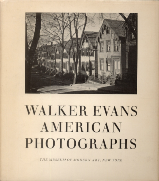
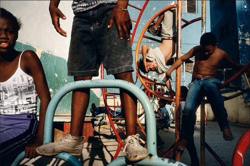
Walker Evans was born in St Louis, and lived in many large cities, such as Chicago, Toledo and New York City. After dropping out of school, he worked as a night attendant in a library. He studies in Paris for a year, upon his return, he joined a literary art crowd in New York. He started photography in 1928, whilst living in New York. He photographed Cuba for 3 weeks, however, some of his photograph were taken by the Cuban authorities due to them being too critical of the government, though he left some with his close friend Ernest Hemingway. This representation of the government can be seen as one of the traits of his photography. This leads to his American Photographs book, which aims to show the reality of America, during the end of the Great Depression. Whilst most photographer at the time, who took photographs of the best subjects in America, similar to the American dream, presenting America as a very beautiful and wealthy nation, showing the skyscrapers of New York and Chicago, and its natural landscapes. Instead, Walker Evans showed the reality of the lives of most Americans, who were not upper class. His photographs show small rural working class communities in places such a Louisiana and Alabama, as well as the lives of the poor, and African Americans, who were facing very prevalent racism. His photography book, American Photographs seem to show a clear understanding of the lives of the less fortunate, making it very socially conscious. Another way this book differed from most photography books at the time, and the reason t is considered of of the most influential photo books of all time is, is due to Evans using a small, portable 35mm camera, such as the Leica. Most photographers at the time used large or medium format cameras, used for capturing great detail in each photograph. This was done to make the photographs more appealing, presenting the American dream as real. Whilst Evans isn't trying to say that the American dream is dead or not real, he attempts to present it as not available for everyone, only the upper class. His combination of many genres of photography, such as street, architectural and landscape photography, shows the versatility of the portable 35mm camera. Whilst this initially didn't have a big effect on amateur photographers and civilians, it inspired other photographers to take candid photographs, and well as other genres of photography, using small, portable 35mm cameras. Evans despised abstract and surrealist photographers, as they did not realistically portray reality. His view on this was rather controversial at the time as surrealist and abstract photography was favoured by people in the 1930s, this was similar to how he presented his photography, as he was one of the first people to photograph America in a non idealist viewpoint, showing that it is not a perfect country. Photobook such as this are important for photography culture, as they are the best way for an artist to convey a message and their photographs toothier target audience.
History of the photo Zine
Zines were first made by science fiction fans of the 1930s, who used it to make comics, and anted to distribute it at a low cost. However zines became much more popular in the 1970s and 80s with the rise of punk culture, as they could be made very easily using a photocopier. This made it easier than before to distribute information about punk bands and information on shows. This inspired many artist, who were attracted to the diy aspect of the zine, and wanted something more raw and personal than a large, high quality, hardback photobook. Zines also encourage collaboration between artist, and often artists collaborate on the making of a zine. Zines often have come in a limited number of copies, in most cases, less than 1000 copies, which means some early zines, have very few left, making some zines very collectible. Ziensn are also a great way for new artist to gain recognition. Zines are significantly cheaper than traditional phonebooks, and therefore make it easier for a beginner photographer with a low budget to gain recognition and feedback for their work, at events such as zine fairs.
Manufacturing Zines
Hand bound zine - Hand binding a zine can be done using many different binding methods. Japanese binding is most popular, as it looks very professional, yet also hand made. Perfect binding can also be done at home, and also looks very professional. It is one of the easiest methods of bindings, and can be done by glueing the pages to a piece of folded paper. Wiro binding can also be done at home, however, it is somewhat difficult, and it doesn't look as professional as the two precious methods. The pages for hand bound zines can be printed at home using thicker paper, or professionally, if the artist has a larger budget.
Folded Zine - A hand folded zine can be made at home easily. An A3 page document can be made in photoshop, and the 8 photographs which are used for the zine can be placed onto the template. This can then be printed out using a home printer, and can then be folded specifically, so that it resembles a zine. This is a very cheap way of making zines, however, it doesn't look very professional, and should just be given away to people for free, at events. This kind of zine I reminiscent of the 1980s punk era zines.
Print on demand zine - A print on demand zine often looks the most professional, as the printing companies that are commissioned to print zines, have a lot of experience. A digital version of the zine can be submitted online, and as many copies can be printed off as the artist wants. The printing service also offers a range of options regarding paper type and thickness, binding etc. However, a print on demand zine is also the most expensive way to get a zine made.
American Xerography
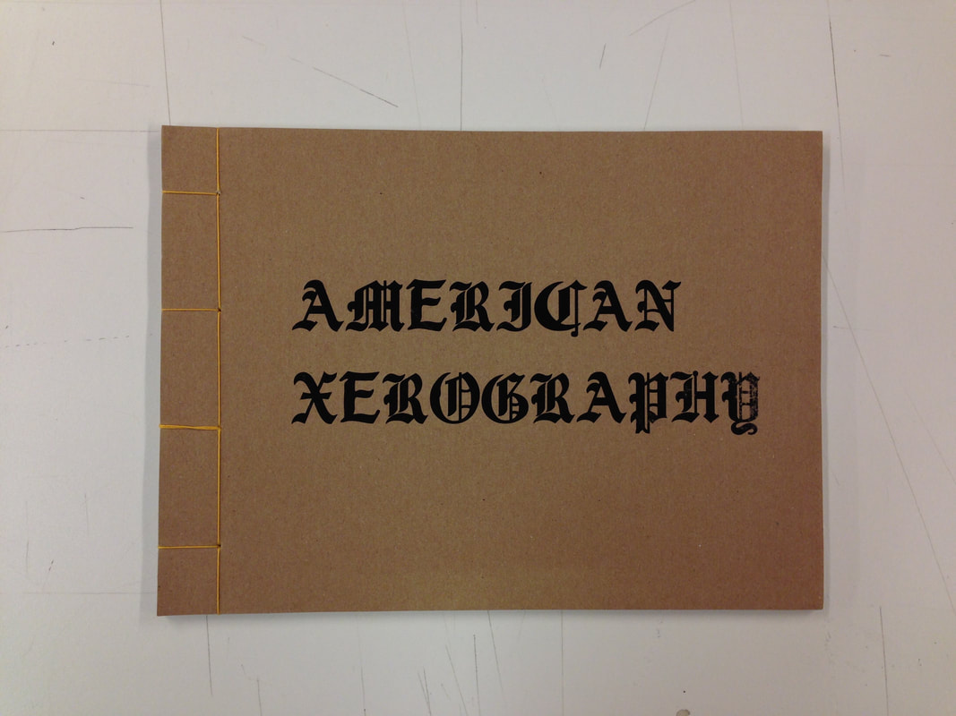
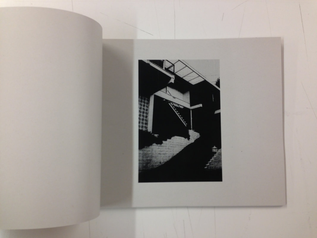
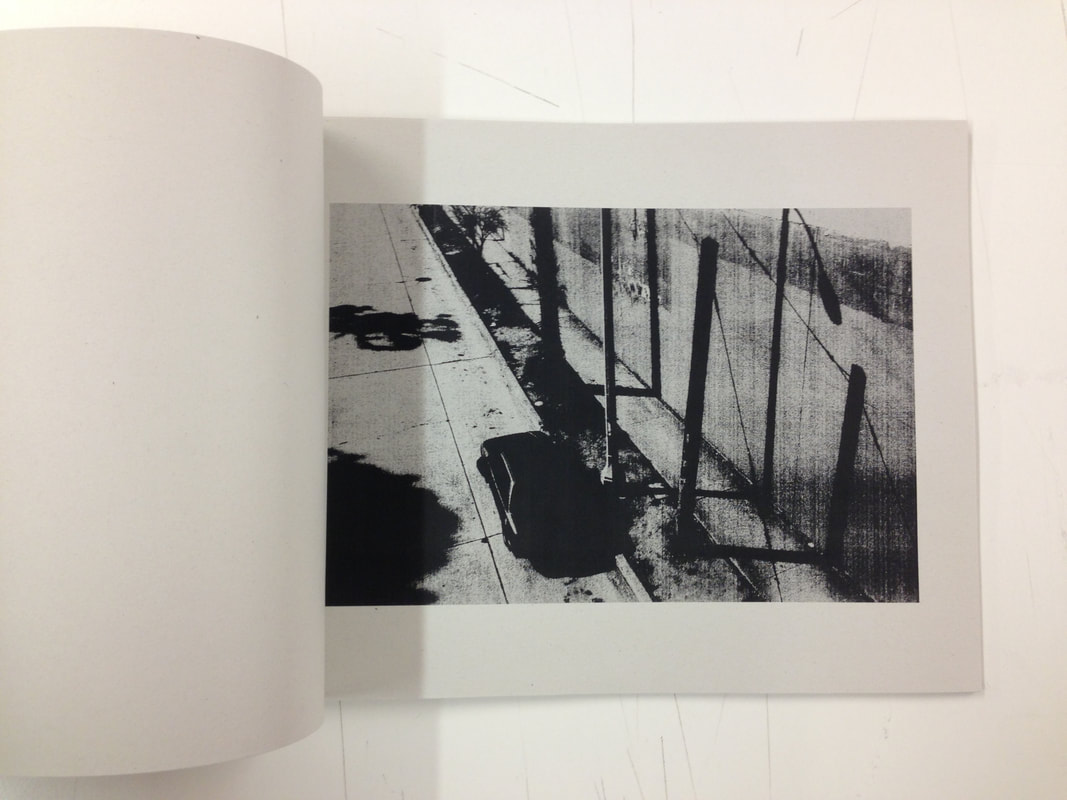
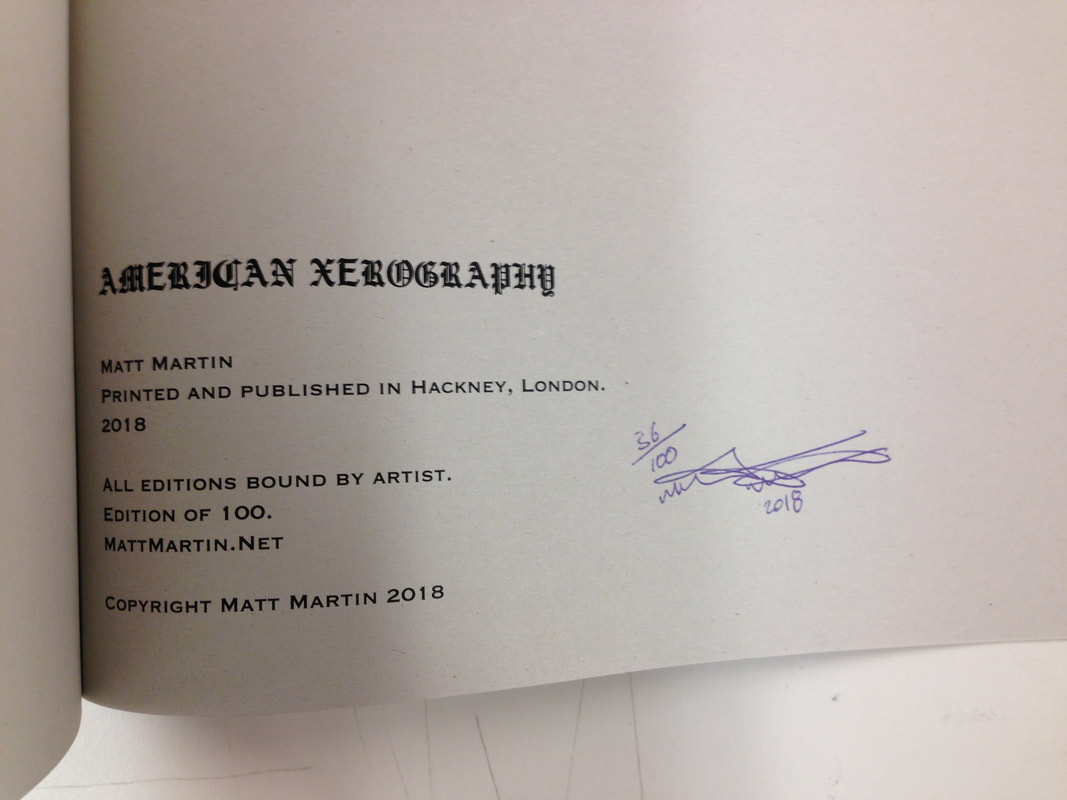
American Xerography is a photography zine published by London based photographer Matt Martin, in 2018. This photography zine contains photographs taken on the west coast of America, primarily Los Angeles. His photographs are copied by a photocopier, which creates the rough effect of his photographs, in which the shadows are very dark with almost no way to tell what is in the shadows. His photographs also have high contrast and little mid tones, this goes very well for the photographs, as they are taken in Los Angeles, meaning many of them have palm trees or cacti in the background, which are considered to be an icon of the city. The zen has 48 pages which is quite a lot for a zine, whilst this could be somewhat much for a zine, however, the lack of text in the book, and only one photograph per page means it is enjoyable to read, without any interruptions. The zine is hand bound using Japanese book binding, which looks professional and also personal at the same time. This was manageable by Matt Martin, as only 100 copies were made.
End of Manufacturing
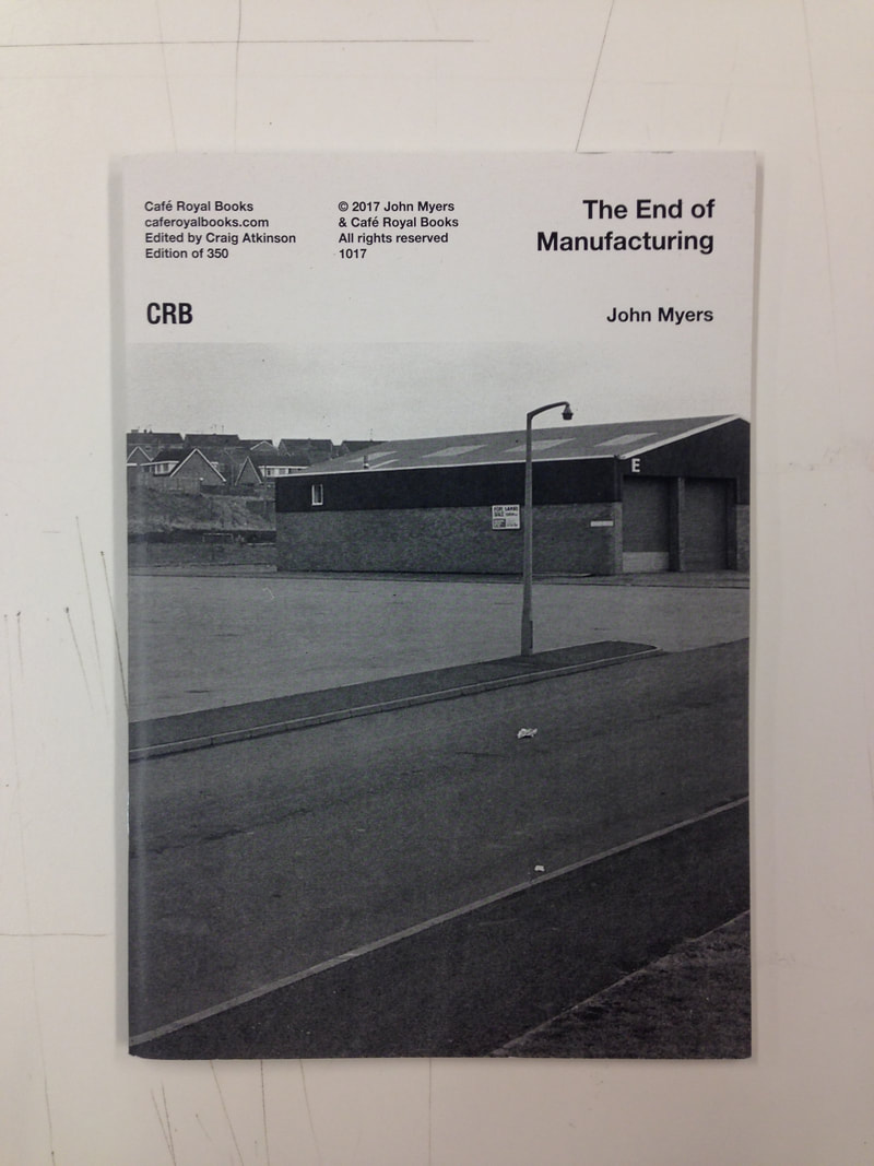
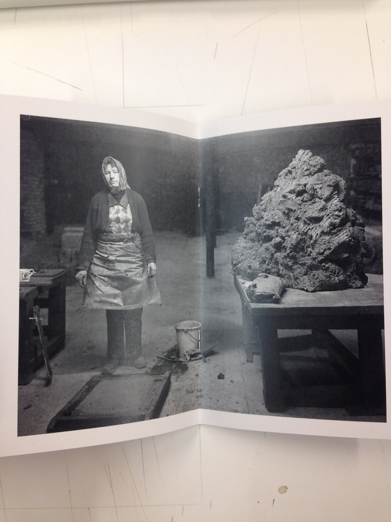
The photographs for End of Manufacturing were taken by John Myers, and was published by Café Royal Books. It is a small zine with very few photographs. It is about the end of Manufacturing in the United Kingdom, due to other countries offering cheaper labour. As a result of this bleak outlook on the future of production and manufacturing in the United Kingdom, the photographs are also bleak and melancholy, and due to this end in manufacturing, the lives of thousands are changing, for the worse, as they now do not have a job, and due to them having worked in manufacturing all their lives, they also likely do not have a lot of knowledge of other types of work and opportunities they may have. Due to some possible discrimination to the working class, most of these people would find it very hard to climb the social ladder, and find a job which is not physical labour, such as working in an office.
ELEVEN PRIVATISED PUBLIC ASSETS
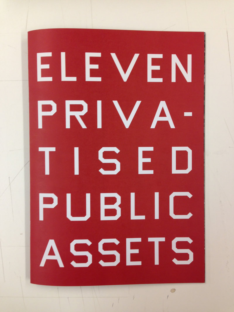
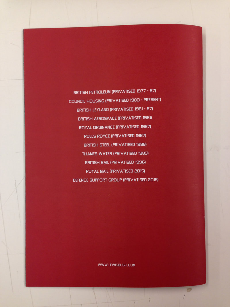
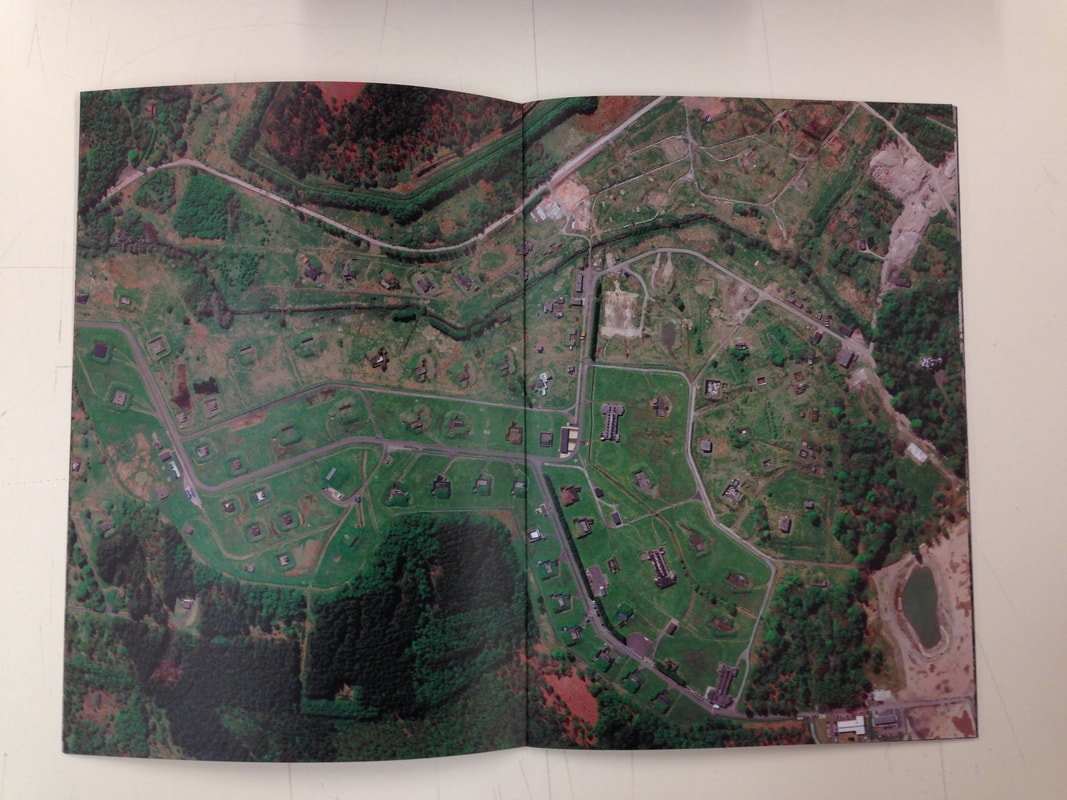
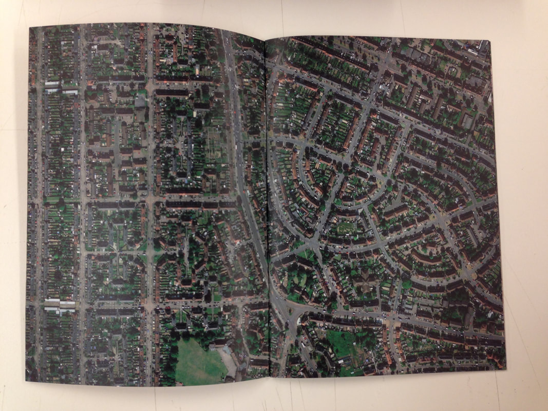
This photography zine is about various locations on the United Kingdom, which were once public, but were at some point, privatised by the government. The photographs were not taken by the artist himself, but by Google Earth. The artist took screenshots of these places, in order to show that they are still somewhat public, as they can be viewed on the internet, even if they are technically made private my the government. This photography zine is one of the ones that have a political message, and it also shows the transparency of all things, public and private, thanks to the internet, and technology such as Google earth. This raises many questions, mainly, wether this is a good thing or not?
Lewis Bush
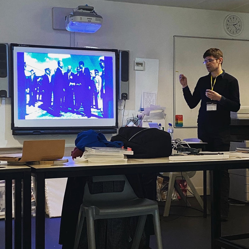
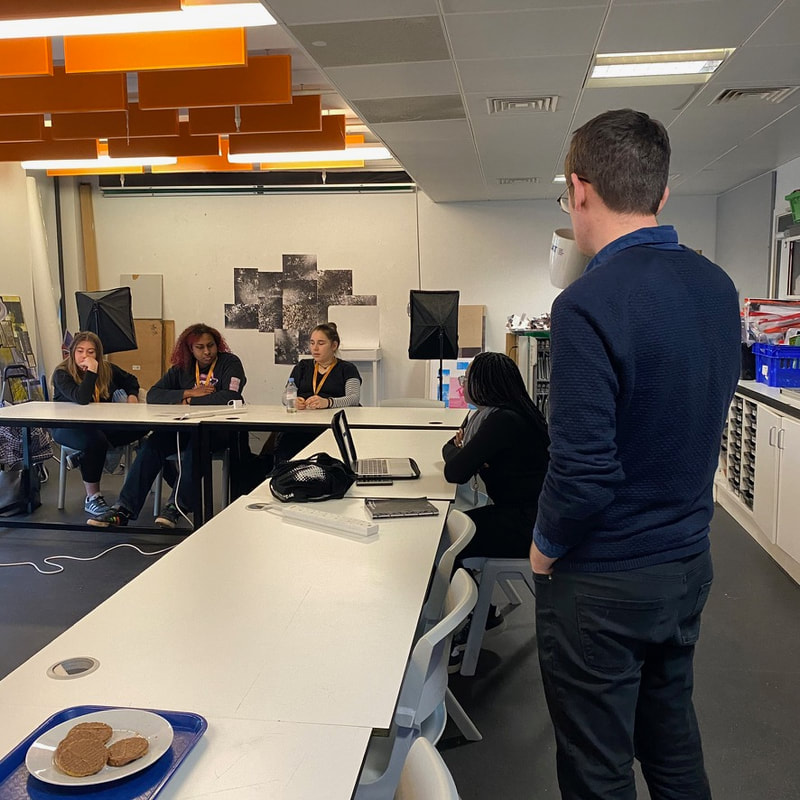
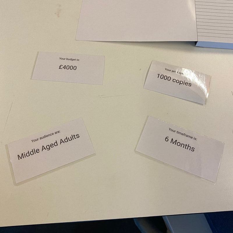
Doing the Lewis Bush workshop, we were introduced to some of Lewis Bush's books, and we were given a random scenario, where our groups picked cards with different factors on it, including the budget, the target audience and the number of copies that were to be printed. We were then given the task of creating a photography book / zine, which fits the conditions that were given. The group I was in, was given a large budget, a long time, but a target audience of elderly adults. We had the benefit of having a Long time and a lot of money. We had the idea of using Black and White medium format film, in order to create a vintage look for the photos, which may appeal to the older generation. We also thought of making the zine a large printed zine, resembling a newspaper. The subject was the development of buildings on shooters hill road, over time, and how buildings have changed over time.
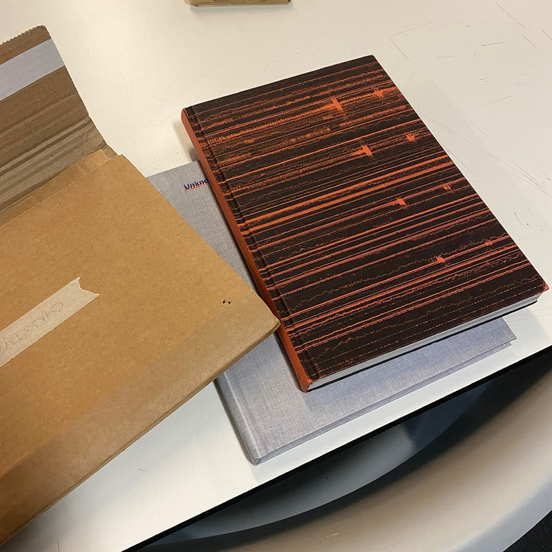
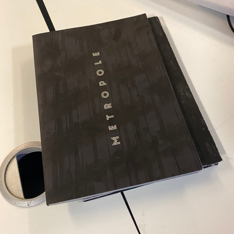
'Metropole' - Metropole is one of the books which Lewis Bush showed us. I was a book he created, with the intention of showing the redevelopment of London, and the housing book, which has increased property prices all over London. The first half of the book shows the model houses which are being build all over London, and are barely lived in, and are sold to wealthy foreign investors instead. The second half of the book shows a collection of the computer rendered photos of what the buildings will look like once they are finished. This shows the irony in the renderings, as they are shown as a family friendly atmosphere, which is busy with the people living there, whereas they are not occupied by many people. The book was somewhat created out of Lewis Bush' frustration with the housing market in London, which is now becoming too expensive to live in for many, and decent affordable housing is no longer a basic right or people.
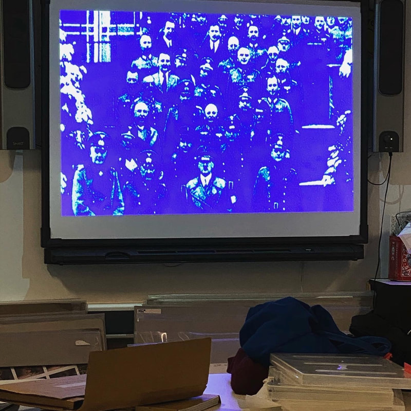
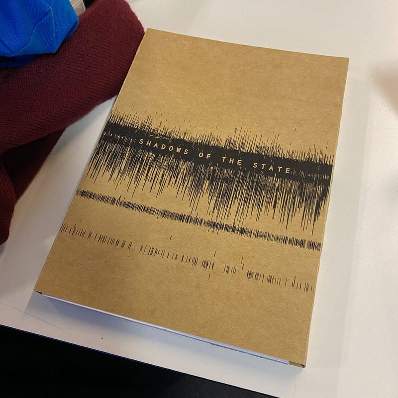
'Shadows of the Sate' - This book explores some of the abandoned and destroyed relics of the Cold War. This book shows the coordinates of Cold War era radio stations, which were used for spying. Nearly all of them have been disassembled, however, their place can still be seen, in subtle ways, such as the lack of trees in a certain area in a forest, or a remaining concrete base. Bush used Google Earth to take photographs of the places where the transmitters once were. Lewis Bush also listened to the code which was transmitted through the radio channels, and he took photographs of the radio waves.
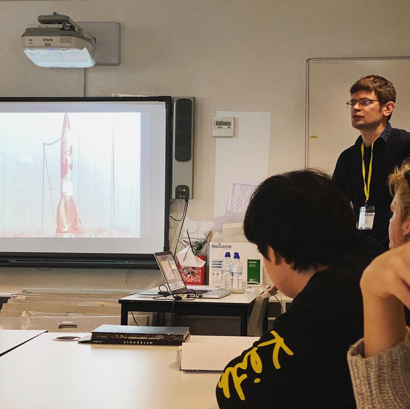
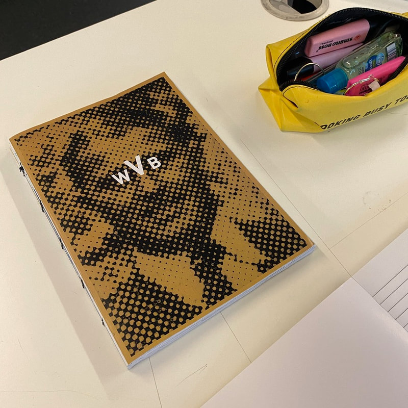
'W v. B' - This is a book which explores the professional career of a German engineer, Werner Von Braun, who worked for the nazis during the war, and was later hired by the USA, due to him being the best in his field. The irony in his career is shown in the book, as he had a close relation to Adolf Hitler, the leader of Nazi Germany, and later, after the war, also personally met John F. Kennedy, due to his contribution to multiple American space missions.
'Metropole' - Metropole is one of the books which Lewis Bush showed us. I was a book he created, with the intention of showing the redevelopment of London, and the housing book, which has increased property prices all over London. The first half of the book shows the model houses which are being build all over London, and are barely lived in, and are sold to wealthy foreign investors instead. The second half of the book shows a collection of the computer rendered photos of what the buildings will look like once they are finished. This shows the irony in the renderings, as they are shown as a family friendly atmosphere, which is busy with the people living there, whereas they are not occupied by many people. The book was somewhat created out of Lewis Bush' frustration with the housing market in London, which is now becoming too expensive to live in for many, and decent affordable housing is no longer a basic right or people.
'Shadows of the Sate' - This book explores some of the abandoned and destroyed relics of the Cold War. This book shows the coordinates of Cold War era radio stations, which were used for spying. Nearly all of them have been disassembled, however, their place can still be seen, in subtle ways, such as the lack of trees in a certain area in a forest, or a remaining concrete base. Bush used Google Earth to take photographs of the places where the transmitters once were. Lewis Bush also listened to the code which was transmitted through the radio channels, and he took photographs of the radio waves.
'W v. B' - This is a book which explores the professional career of a German engineer, Werner Von Braun, who worked for the nazis during the war, and was later hired by the USA, due to him being the best in his field. The irony in his career is shown in the book, as he had a close relation to Adolf Hitler, the leader of Nazi Germany, and later, after the war, also personally met John F. Kennedy, due to his contribution to multiple American space missions.
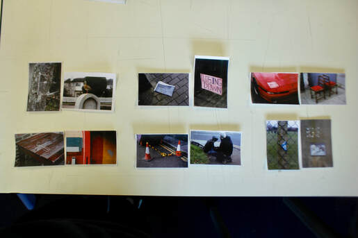
Sequencing photographs
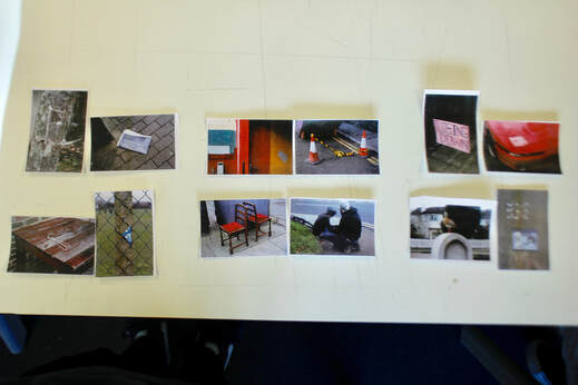
I sequenced these photographs, mainly paired based on colour and composition. The first photograph in the sequences shows a flyer that was once on a tree, and the protective film can still be seen around it, stapled to the tree. This could be seen to represent urban decay, and how everything decays to some extent when not maintained my people, this is somewhat complemented by a photograph of a newspaper on the floor, showing that people lose interest in things, and stop maintaining things. the next two photographs are simply paired due to their similar colours, and I believe this is one of the weakest pair in the series. The next to photographs are paired due to their compositions. The sign on the left is a rectangle, similar to the headlight of the car in the photograph on the right. They also have a similar red colour. The next photographs are related as both of the photographs include pieces of litter, that people have abandoned as the possibly no longer need, this relates to the first pair of images, and continues the theme of urban decay, and people losing interest in their possessions. The next two photographs are paired in a humorous way, as one of the people in the photograph on the right has fallen, and the photograph on the left depicts two chairs, which the people could sit down on. The last pair of photos are grouped based on their concrete grey colour, which depicts a city well. As a whole, I believe that these photographs are paired in a way that conveys the theme of gritty urban decay well, showing humour along the way, giving the message and idea a lighter tone, showing fun events that may occur in the city.
Importance of the photobook
Thought history, it was often difficult for photographer for their photography to be considered fine art, as photographs are usually not seen as thoughtful difficult as creating asa painting, or other artwork. However, the photobook is very important for presenting photography as more fine art, than just documentation, as it was seen before. The physically appealing look of the photobook helps present the photographs as something which is not just chance, but something with a lot of work and effort behind it, as it the case with most photographers. These physical aspects of the photobook, can also help make the book look more professional, and something which is a work of art, rather than one of the handmade scrapbooks of photographers. The thick paper, the hardcover, and the careful sequencing of the photograph all help make it seem more like a work of art, than simply a book, used to get a message across.
What is a photobook?
A phonebook could just mean a series of photographs in a book. However, there are many variations to photography books, some include text, some so not, the there are different sizes, as well as differences in paper type, cover type and binding type. I could be said, that a good photography book is one which attempts to convey something through the photographs, and implies something other than the obvious subjects shown in the photos. This message is up to the photographs, and the way the photographs are arranged, and possible text included in the book, could all be used to help convey this better. It is also important to make sure that despite the intention o the photographer, to convert this message, they do not forget to make the phonebook look appealing, so it is also pleasing to the eye, as well as having a message and purpose.
Photobook Dummy
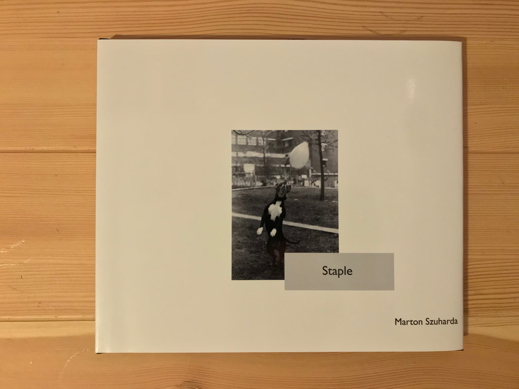
This photography book is about street photography in London. Whilst it is about London, I have had to include some photos that I have taken in Budapest in the winter, as I do not have enough photos in London yet. In the final photobook, all the photographs will be Black & White 35mm film, as well as possibly colour film. The B&W film I used is Kodak TMAX 100, as it is good to use in bright daylight, as it has low grain and low iso, however, it is much less fine than a B&W landscape film, meaning it still has some film grain which is reminiscent of 1930s-1960s street photographers. The artist I gained inspiration from is Henri Cartier Bresson, and I attempted to pay homage to his work, by using TMAX, a similar B&W film to Tri-X which I what he took his photographs in. The colour photos will be added in order to contrast the timeless B&W photographs, to show the more modern era of photography we live in, yet still using film, to show the techniques and methods that the celebrated photographers of the 20th century used. I used the idea of a frame within the photo, for another layer within the frame, making the composition more interesting. This can be observed in some of Henri Cartier Bresson's photos, as he uses things such as his photo of people walking through a broken wall during the Spanish civil war. In my photos, due to being in a busy city, I used things such as shop windows, bus stops and doorways as the frames. The title for the book is not final yet, however, I believe that 'stapled' may be good, as an idea that I try to communicate through street photography is that the city that people live in is connected by them, and without the people, the city doesn't have a point, as it is made to accommodate many people, and therefore, the residents of a city staple it, and make everything work.
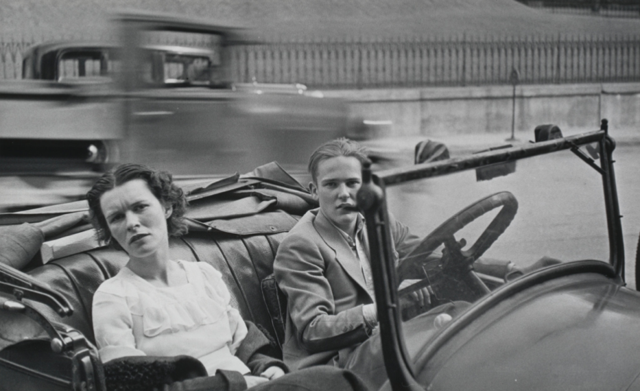
The Americans - Robert Frank
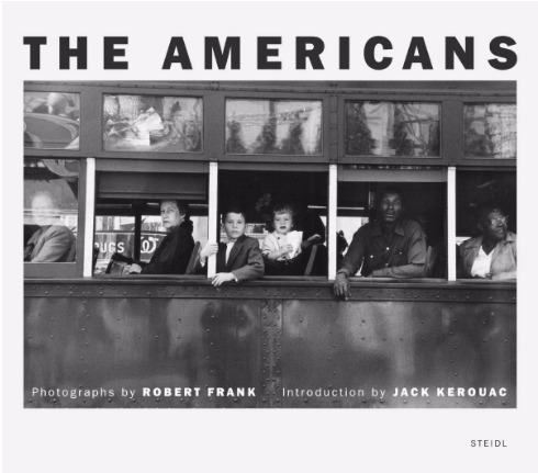
This photobook by Robert Frank is created to accurately represent America, and the people living there. It portrays a wide variety of people from many different backgrounds, classes and states. This is somewhat related to the idea of my dummy book, which is about how different people are key to the functioning of a city, and how they live in a city. I have attempted to capture this using candid street photography, which is what Robert Frank was using to photograph his subjects, who are interaction with others, or with features of the city they lived in. Due to the time Robert Frank lived in, he was unable to use anything other than film to take his photos. This is different to my situation, as I am able to use a digital camera to take the pictures, however, due to my theme being similar to what famous photographers in the 1930s-60s did, I chose to use 35mm film, to make my photograph have a similar look to the famous photographers of the time. It is also beneficial to take photographs the way they would have been taken many decades ago, without the benefits of modern digital cameras, such as autofocus, auto exposure and aperture settings, and a high frame rate which reduces the amount of thought and effort that we put into photographs. The lack of modern technology, and and the limited number of frames on the roll of film, forced me to think more about my composition and exposure settings, meaning I get a higher number of usage photos on a roll.
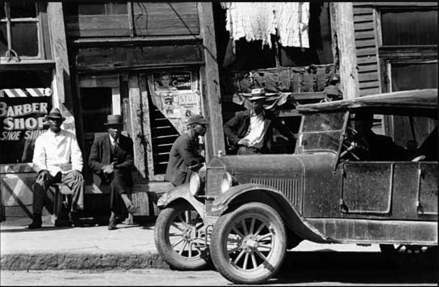
Incidents - Henry Wessel
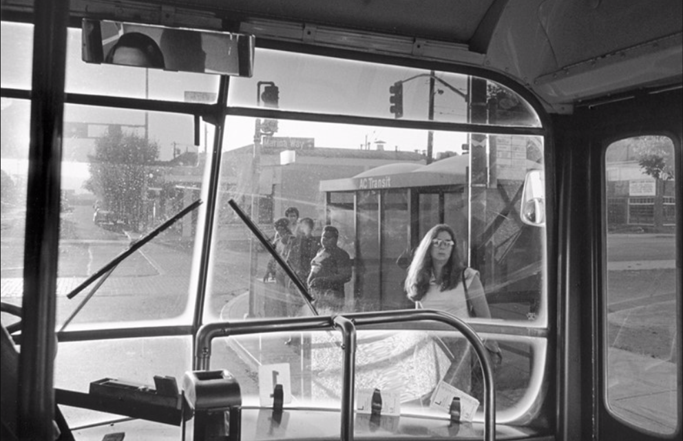
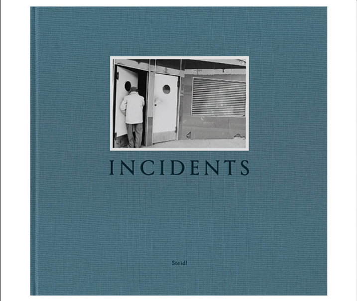
Incidents is a photobook which includes photos of people and buildings that were taken in Los Angeles, California. Most of the photos in the book have human subject, which links closely to my photos, showing the activities that people do in the city. Henry Wessel's vary somewhat from my photos, and they are very high quality, and there is an emphasis on the quality of the book and the prints in it. They were also edited in the darkroom so that no part of the photo, even the shadows are light enough that you can make out the details, this is very different from my style of photography, and my photos often have high contrast and deep shadows, as I believe the the content of the photographs are more important that the quality of them, and the emotion and ideas that they convey, make up for this. This similar style can be seen in the photographs of Robert Capa, who also used 35mm film to capture moments of war. However, I like the presentation in the book, and how the photos are printed large to show the detail in the photos. I believe it could be interesting if I contrasted
Bystander: A History of Street Photography
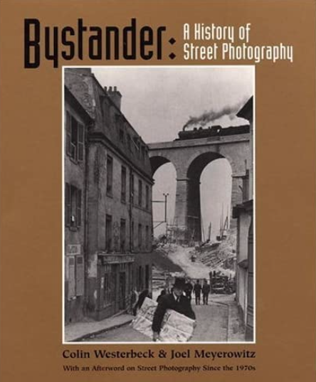
Bystander is a photobook, published in 1994. Colin Westerbeck and Joel Meyerowitz discuss the changes and developements of street photography. This book is not about the writers displaying their work in a book, but rather, explaining what the greatest street photographers have done in the past, and how their photographs have influenced other photographers, and possibly changed he definition of photography. The book includes the work of photographers, such as Brassai, Bresson, Kertész and more photographers, who have had an impact on photography. This shows that a phonebook, can not only be used to showcase the work of an artist, but also to raise awareness of what are regarded as some of the best photographs by some of the best photographers, to people looking to explore the genre of street photography and learn how to improve.
Making a Photobook
Binding-
There are many types of binding types which I could use for a zine, such a perfect binding, Japanese book binding, and wire binding. Of these, I believe that the Japanese binding is the best for a handmade zine, however, I would like to get my book printed on demand. For this, I believe that perfect binding is the best, as it looks the most professional.If I choose to do a book, instead of a smaller zine, I have less options for binding, and larger books are herd to bind in a professional way. If I get the book printed professionally using blurb or other printing services, they will most likely glue the pages onto a hardback book cover.
Paper types-
Both zines and books can be printed on many different types of paper. The most popular option for printing books and zines is silk paper. Silk paper is in between matt and shiny paper, and it is very good, as it not too shiny, yet it retains the almost perfect printing surface for photographs, like shiny paper. Other types of paper can also be used, such as matt and recycled paper, however, these types of paper tend to absorb some more ink, making the photographs printed on them lower saturation and contrast.
Making a book- Traditionally, photobooks are hand make. The photographs are printed in the darkroom, and they are arranged physically. This process is obsolete, as photobook are now mostly done digitally, using software such as bookwright, or InDesign. This digital file is then printed professionally.
My final photobook
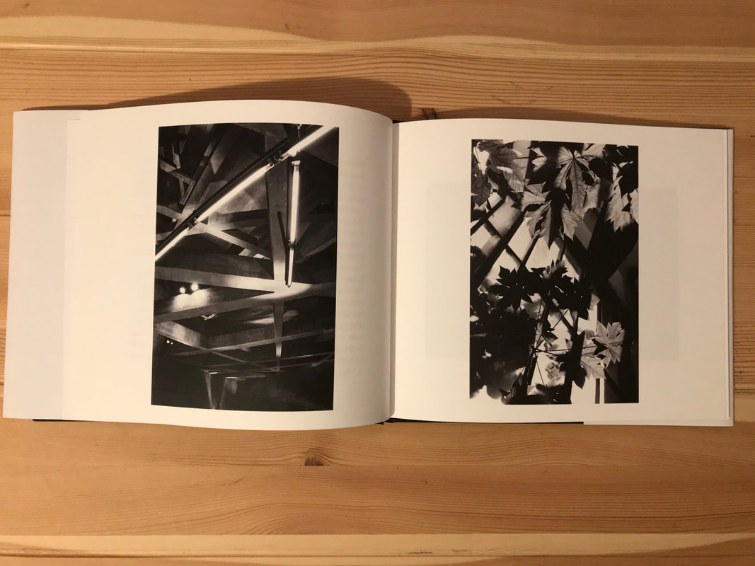
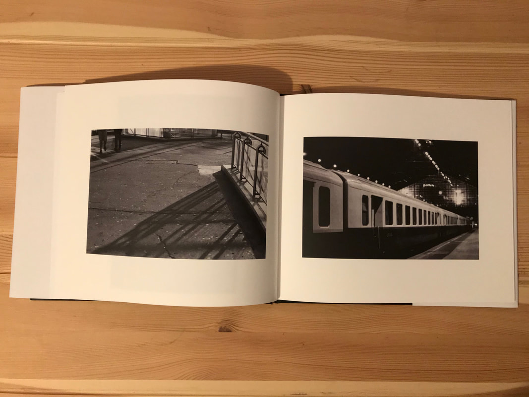
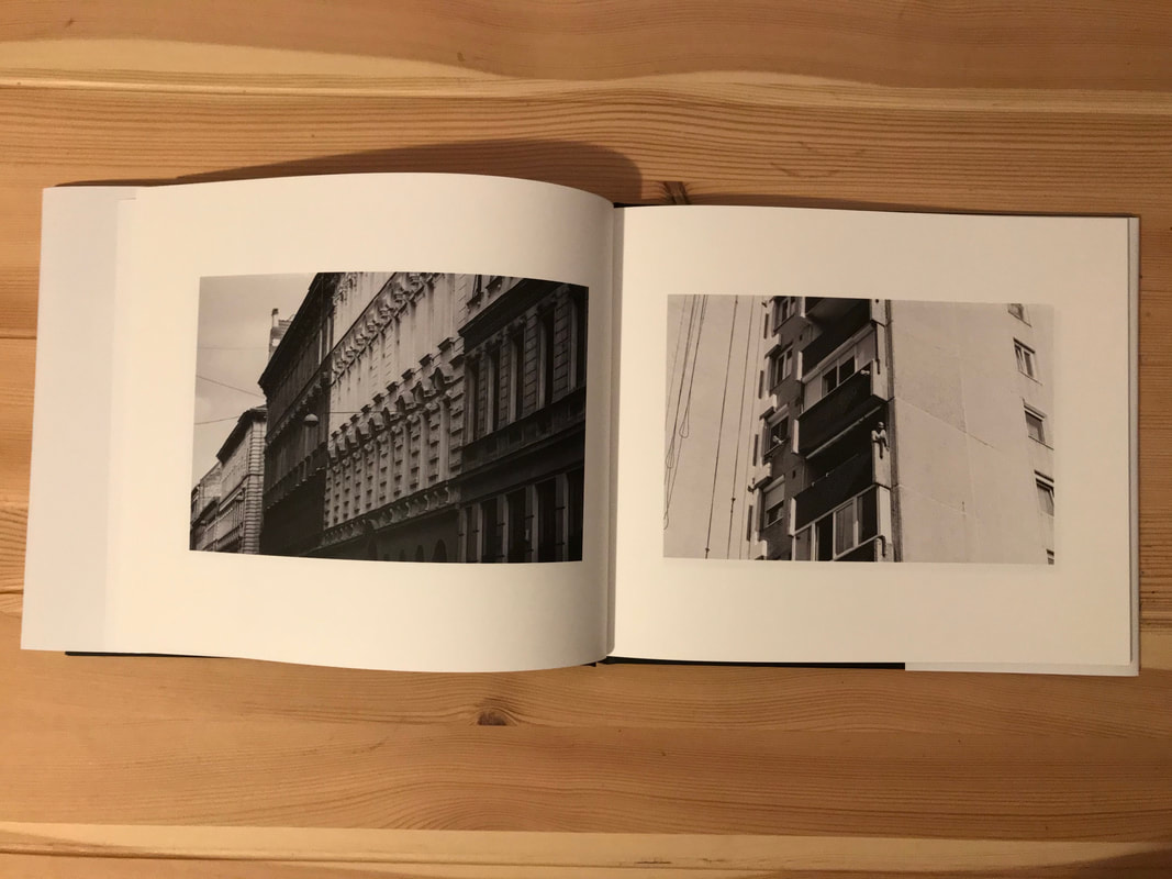
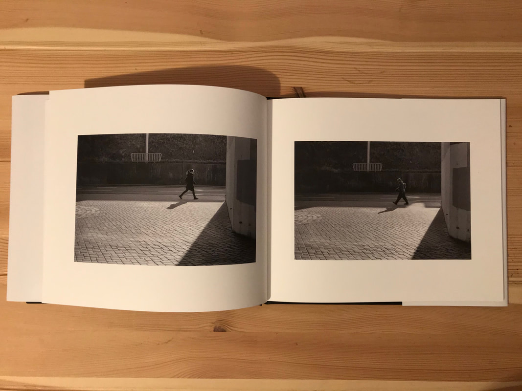
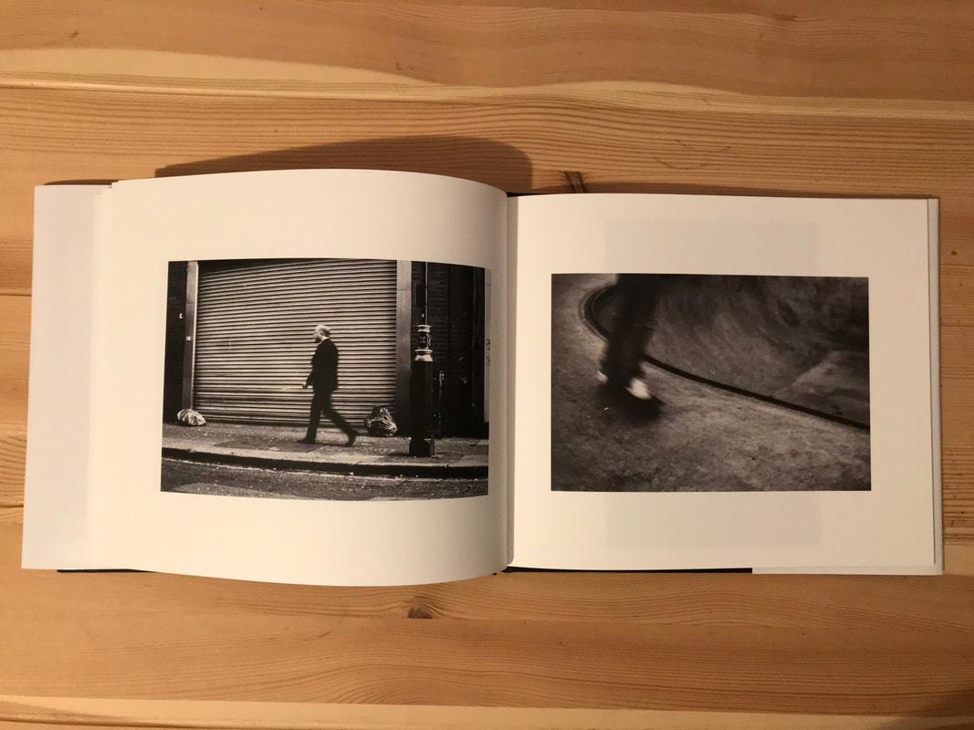
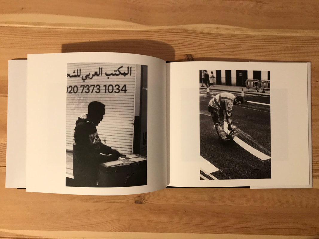
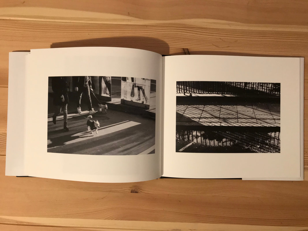
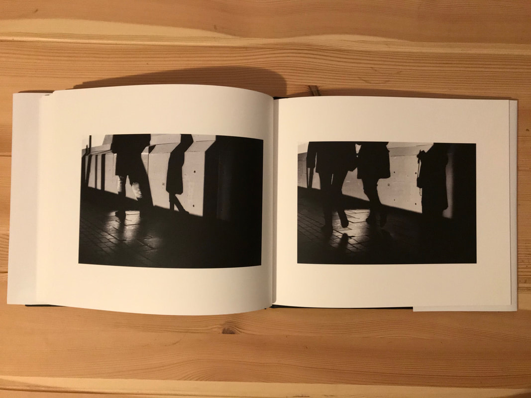
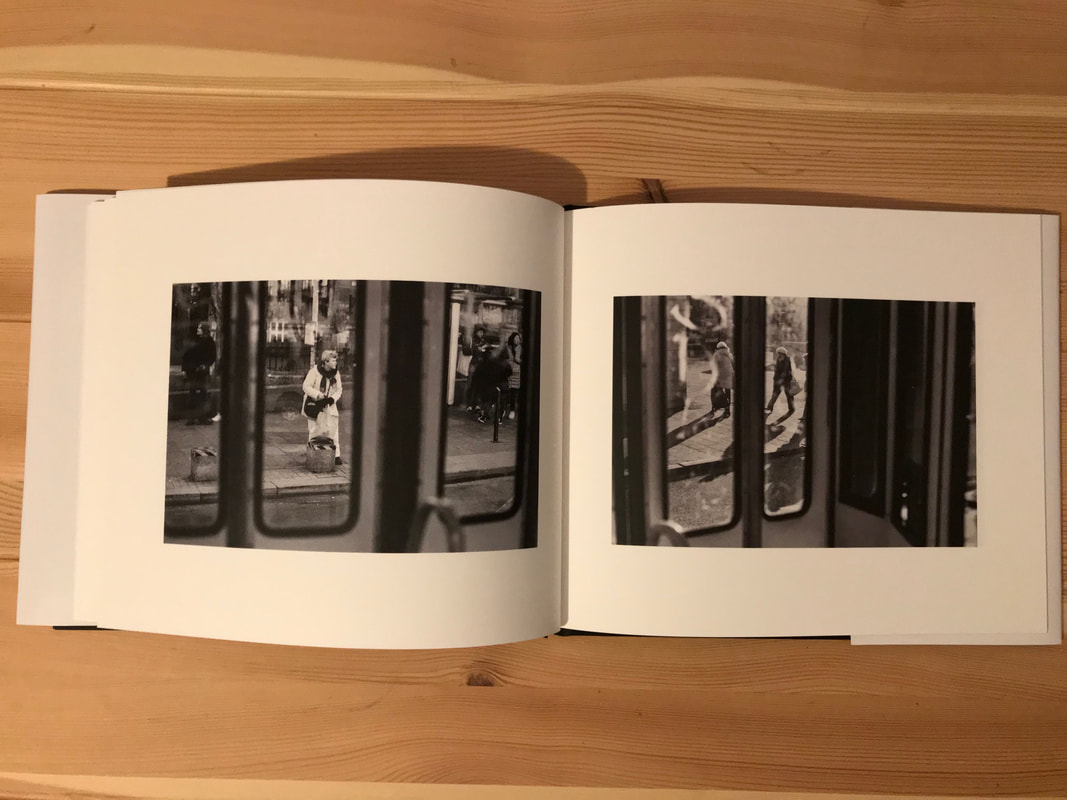
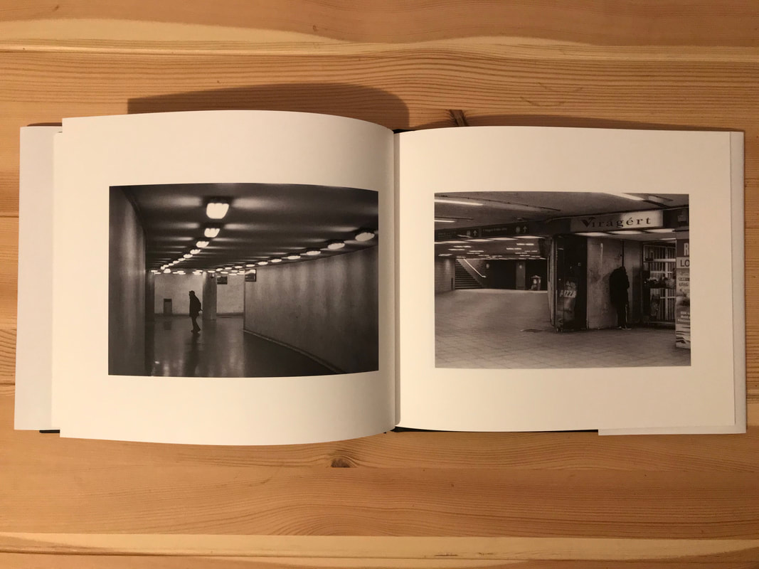
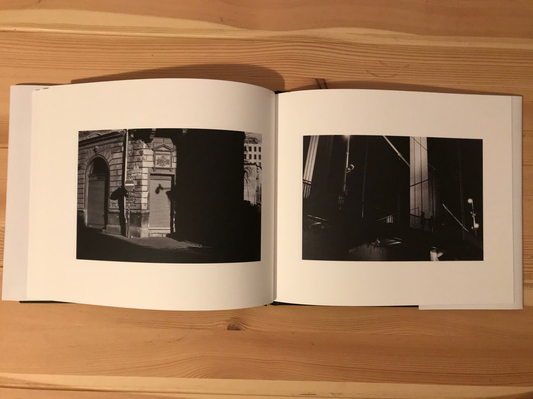
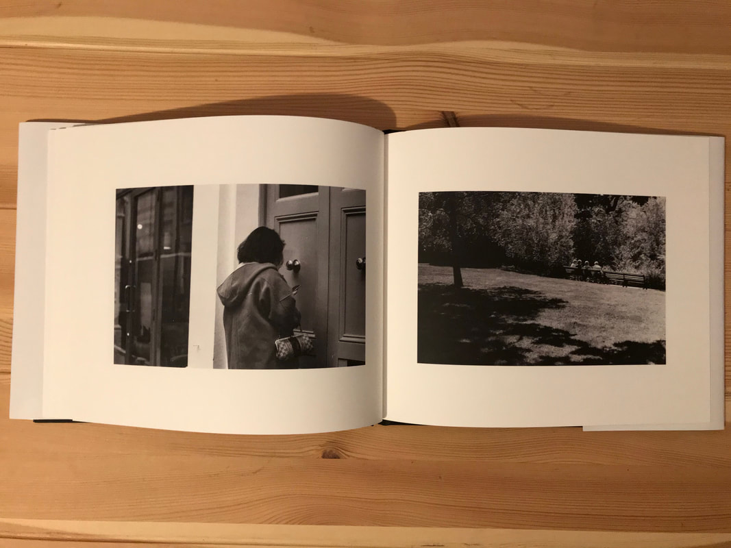
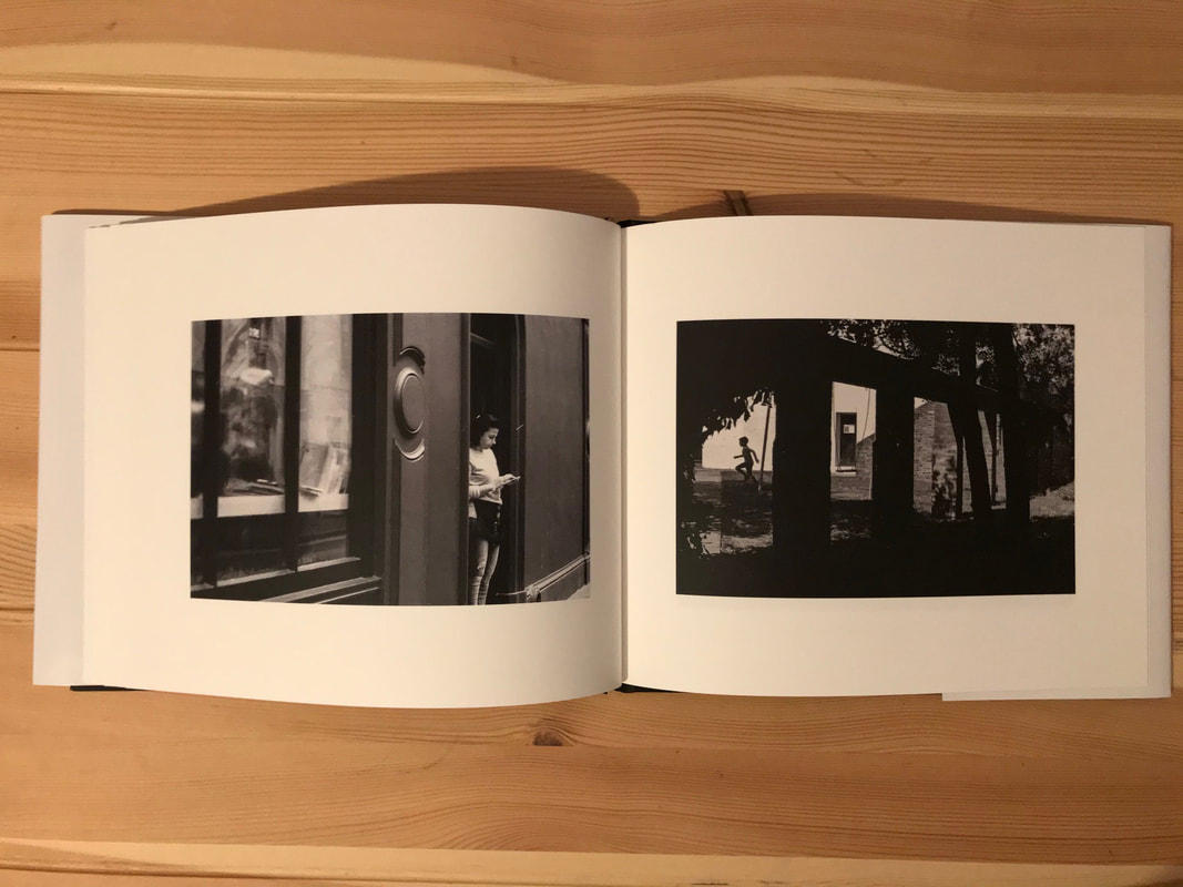
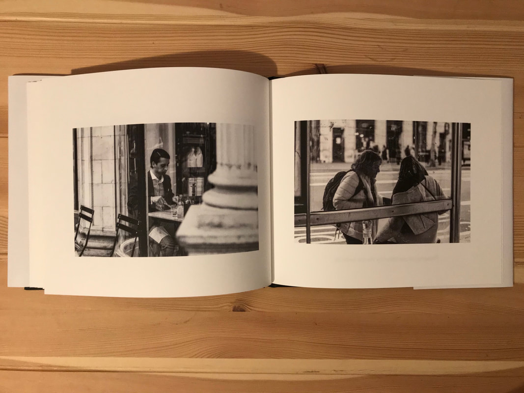
I have received my final, printed photobook, from Blurb, after deciding to get it professionally printed on demand. I spent a long time talking the photographs for my book, and I believe I have a large selection of good photographs. I would have liked to use more photographs which I took specifically for the photobook project, however this became a challenge, after the UK went into lockdown. Even if I managed to take some photographs around my neighbourhood, most photo labs were closed, and I wouldn't have been able to finish the book. I ended up using some photographs which I took on film earlier, however this was not an issue, as all the photographs are taken on film. I believe that all the photographs go well together, for this reason. I also thought carefully about the layout of the images, I placed two related images next to each other on a fold, in order to make it more interesting. In some cases, I matched the photos by a common texture, or by a repeating motif, in other cases, it was as simple as a line which is see in both photos. There are some weaker photos in the book, I attempted to overcome this negative, by placing the worst photos, next to better ones, making it slightly more captivating.
The idea behind my photobook is for it to be a way to pay homage to the great photographers of the 20th century, who have shaped the way we look at photography today. They all used 35mm cameras, and black and white film, as it was the standard at the time. This format is very unpractical in the computer age, however, many people still choose to use film. My concept is very simple, and I believe that my photobook conveys this well. It has a very simple layout, with one photo on one page, and a simple introduction/explanation at the beginning.
The title is the word 'staple', I chose this as the title, as due to it being mostly street photography, it is about the relation between the residents of a city, and the buildings in the city itself. The residents of a city staple the city, as they connect it, and make the city run as it should.
I wanted to paper to be somewhat thick, and matt, as I don't believe that shiny paper looks good in a photobook. The paper in the book looks very professional, and the contrast is very good on the paper, making the photographs look very similar to the original photos.
If I had more time, I would take more photos for the book, as there are currently only 30 photos, and 15 spreads in the book, making it slightly thin. I believe that photobooks look better when they have a lot of pages, however, often they can be too thick, with too many photos, making it eventually boring.
The most difficult aspect of this project was finding enough photographs to put in the book. I had limited time before the lockdown to take enough photographs, and as a result, I had to use some photographs which took earlier. Aside from this, I believe that bookwright was not a very god software to use for making the book. I found it to be quite limiting. For example, the software did not have Gil sans light, only the original version of the typeface. I also found it hard to position text in the right places, and some of the text on the cover does not look good on the final dust-jacket. Furthermore, I found Blurbs printing services very limiting. There were very few options for the size of the book. I was also unable to choose the paper thickness, and finish, past some of the very basic options. I also could not choose if I wanted the cover to be matt or shiny. I thought it would be matt, however, when delivered, it was shiny, which looks unprofessional, and it gets dusty very easily. Although the prints of the photographs in the books looked good, I believe that the service that Blurb provided was very overpriced, and was not as good as I was expecting.
During the course of this project, I learned a lot about the history of the photobook, from the first photobook, by Anna Atkins, and William Henry Fox Talbot, to the famous and important photobooks of the 20th century, such as 'The Americans', and 'The decisive moment'. I learned a lot not only about photobook, but also about the impact that photographer have had on photography, and how many used a photobook to get their message across. I also learned that photobooks are similar to diptychs, as multiple images can be placed together on a spread, either to compliment, or to contrast one another. Many of the ideas about montage theory, apply to to photobooks, for exaple, understanding the relation between the images on a spread, and how it can Make a photobook, flow much better.
There are certain aspects of my photobook which I am pleased with. For example, I like the quality of the print on the pages of the book, as the prints are very similar to how I saw the photographs on my screen, and how I wanted them to look. Despite the matt pages, which I like the look of, the contrast of the printed have not been reduced. I also like the layout I chose, and the relation that the two photos on a spread have. I believe that these things make the book seem professional, and intentional, as if everything has been carefully considered, which it has.
